Website
redesign.

Project
UX and UI design
Logo design
Team
Silke Franken (solo)
Tools
Qualitative user research ✿ Figma
Affinity Designer
The brief
The goal of this redesign was to create a professional, emotionally engaging, and user-friendly digital presence for an Austrian art gallery. The website needed to reflect the gallery’s identity, facilitate visitor interaction, and support the sale and promotion of artworks.
The design process
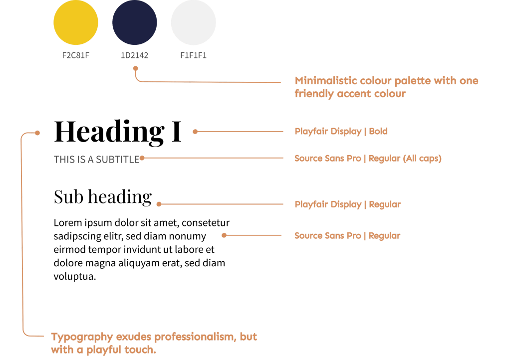
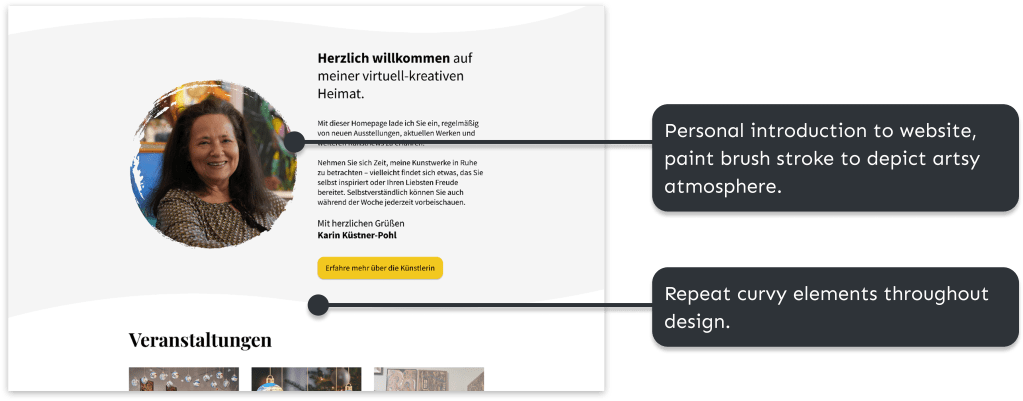
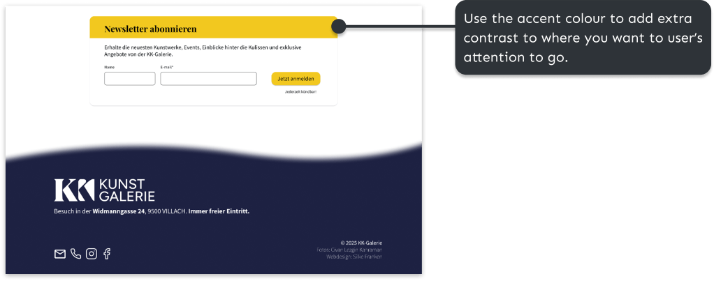
I began by translating the brand and functional goals of the project into concrete design requirements. To create a professional and trustworthy website, the design needed to present up-to-date information, high-quality visuals, and consistent branding. At the same time, it was important for the client that the website felt friendly and accessible. This was achieved by keeping yellow as a warm accent colour, using clear language with a welcoming tone, and incorporating personal content about the artist.
The client also expressed a preference for a playful design featuring shapes and colour. I addressed this by subtly incorporating graphic shapes and yellow accents, while keeping the overall layout minimal to ensure the artwork remained the focal point.


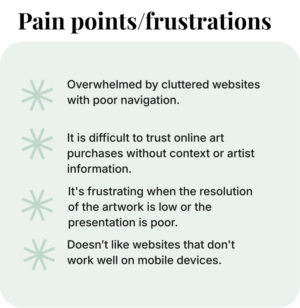
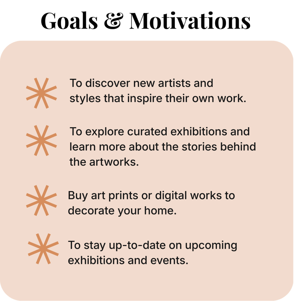
To better understand the target audience, I created a persona, which helped clarify key user needs and expectations. From this, several design focus points emerged:
- Use a clean, minimalist layout that allows the artwork to stand out.
- Prioritise responsive design across all devices.
- Use high-quality images with zoom and pan functionality.
- Provide filtering and sorting options, such as by price or medium.
- Include space for artist statements and behind-the-scenes content.
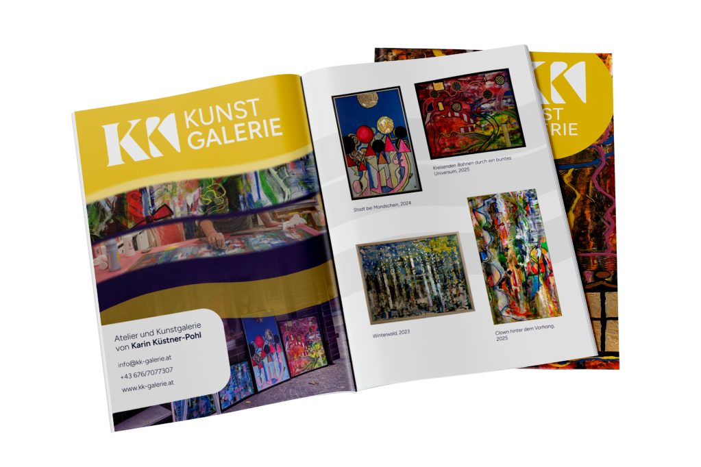
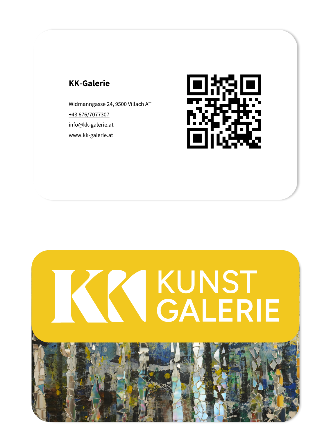
After drafting the sitemap and style guide, I created an initial concept for a new logo. The goal of the redesign was to develop a professional logo that clearly integrated the gallery’s name (KK). I explored several concepts based on combining two K’s (see below), before settling on a design that makes the initials immediately recognisable while subtly referencing the shape of a painting.
After this, I created a low-fidelity wireframe. The client preferred a dark background behind the logo, so I integrated this in the final prototype.
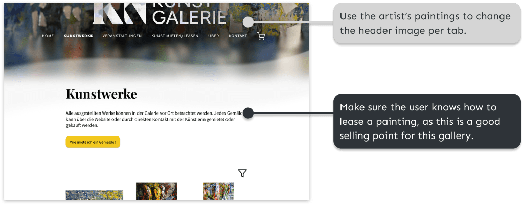
After finishing the final prototype in Figma, I conducted some user tests to test the design. Several users noted the nice possibility of renting paintings, but one user pointed out the following:
“In any case, it’s not clear to me that you can rent things. I would think that an art gallery is just for buying.” (P3)
Furthermore, it was indicated that the filter and zoom option for paintings were crucial elements for online art buying:
I would want an overview of what kind of paintings or art they have. So, if I’m only interested in nature pictures or something. So maybe that I can filter when I’m interested in a category or a size. So if I only have the space for, I don’t know, 50×30, I can filter on that. ” (P2)
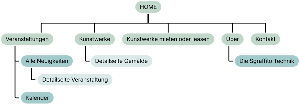
Based on the user tests, the design was further improved. For example, a button was added to the navigation bar informing the user about renting and leasing art. I added a Calendar page to the design, to show the current and planned exhibitions of the artist.
Solution and results
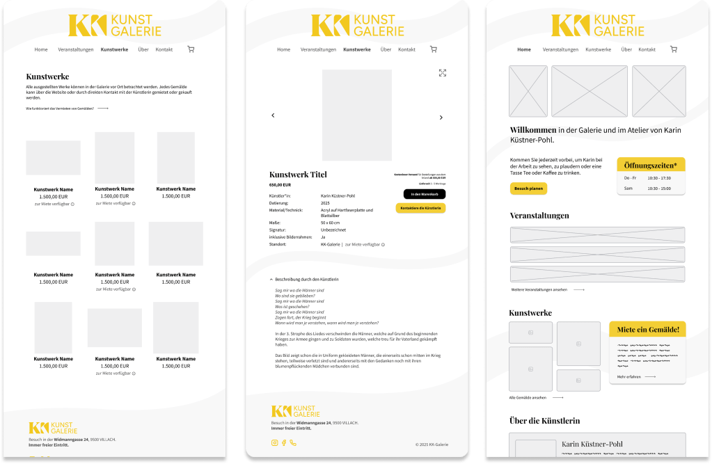
Below, you find the final sitemap and several screenshots of the design of the resulting website.

Reflection
Through this project, I learned to manage my time more deliberately, realising that I spent too long refining the low-fidelity wireframes and that knowing when to move forward is often important as refining details. I learned to accept that “good enough” can be the right choice when deadlines matter. Furthermore, working with a client taught me how to balance specific requirements with usability and design principles, while still maintaining a collaborative process.
The project also reinforced the importance of user testing, as it helped to challenge my assumptions and guided design decisions. Additionally, I gained further hands-on experience with Figma and Affinity Designer, improving both my efficiency and confidence in these tools.
